
First of all, I want to give a HUGE shout-out to my colleague Matt Chambers (aka Sir Viz-a-Lot) for winning the Viz of the Day on Tableau Public! He and I both had the opportunity to attend the 2014 Tableau Customer Conference in Seattle. I have to say, I was completely blown away and would recommend anyone who loves data to try to attend the 2015 Tableau Customer Conference in Las Vegas. You will not find a better place to meet and network with other data enthusiasts.
Not to sound like a broken record but...
The best part about the conference for me was coming back home inspired. At the conference, we decided to attend a breakout session put on by Andy Kriebel (fellow Clemson grad which is AWESOME!), Jewel Loree (she loves data so much she wears it!), and Peter Gilks (a true Tableau Zen Master!). The session was all about data blogging. The presenters are, in my opinion, among the best data bloggers in the world! It made me realize that there is so much data out there that is free, transparent and just waiting for someone to find insight in it.
Although I am not a newbie to Tableau Desktop and Tabelau Server, I am new to Tableau Public. I had no idea that it was such a great resource for dashboard ideas and inspiration. There are SO many creative visualizations out there.
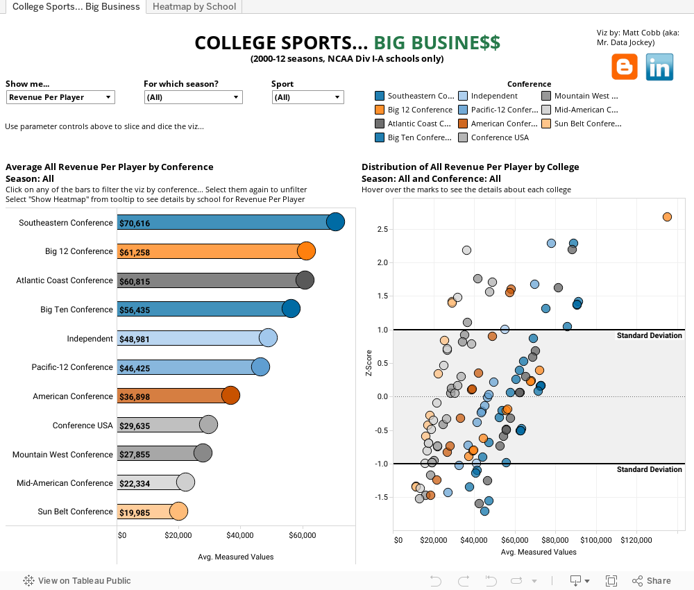
Since I have had some free time lately I decided to work on my first Tableau Public viz. This viz focuses on how for many schools, college are a HUGE money-maker. I decided to look at the data in three different ways: revenue per player, expenses per player and profit per player. These attributes are visualized by conference, on a standard score distribution by college as well as a heatmap by college. The standard score distribution (z-score) lets you see how schools compare in terms of revenue, profit or expenses by player, to other schools in their respective conferences. Any school outside the one standard deviation range is considered to be a unique case; they are either spending, bringing in, or pocketing more or less than the average school in their conference. There are parameter controls built in to allow the user to filter by each attribute as well as by a specific season (2000-2012) or by sport. It is interesting to see how different sports are valued among the different conferences. Check it out below!
Enjoy...
Data source: https://github.com/AragornTech/ncaa_data/tree/master/doe_2000_2013
Excellent first viz Matt! A few nitpicks:
ReplyDelete1. The viz doesn't fit in the screen of a typical laptop. For most laptops, 1200x725 is a perfect fit. With your's, I have to scroll slightly.
2. I would make your bar chart horizontal so that the text is easier to read. You should avoid making you user rotate their head to read it.
3. I find the font a bit hard to read. It looks super tiny.
4. In the heatmap, I wish my filters would carry over from the first tab and then have filtering there too, e.g., be able to filter by conference so I can see all schools for just one conference.
5. I like where you placed the filters. It makes it super easy to know to start there.
6. The descriptions are excellent and make using the viz very clear.
Overall, this is really well done!